Wherever you look, there are graphs with an alarmingly sharp spike in new infections, but most of them can't give you a crucial piece of information: Is the situation really getting better or worse? To answer this question, we have to dive deep into the data of COVID-19 and find a method on how to detect a possible trend reliably. Thankfully, John Hopkins provides us with detailed and daily updated documents about the spread of the virus expressed in confirmed cases on a worldwide basis. Using Python and libraries like Pandas, Numpy, Scipy, and Matplotlib, I am going to give you a blueprint on how to make the dynamic visible and practically implementing a way to report it. All the necessary steps are thoroughly implemented and explained in my Jupyter Notebook.
Making Sense of the Data
John Hopkins uploads all of its available data on GitHub - free of charge. Obtaining everything is not necessary for this analysis, because we only have to focus on one specific file containing the total confirmed cases: timeseriescovid19confirmedglobal.csv
You always want to have the newest data. Hence, you should programmatically download and save it (see my Jupyter Notebook for reference) to get all of the updates. The obtained CSV (Comma Separated Values) file represents the total confirmed cases for each country/region and province/state as a single row. A province/state can be Georgia or Ohio, for instance. Each day is represented as one column - conveniently named with the corresponding date.
Unfortunately for us, it's hard to use the records this way. To untangle it and make the data easily accessible, we convert it into the long-format. Thus, every date column becomes a row with two values: the date and the number of total cases. Here the Python package Pandas can help to read in the CSV file and achieve the desired result by using the melt function.
import pandas as pd

# read csv file as dataframe
df = pd.read_csv('time_series_covid19_confirmed_global.csv')

# turn dataframe into long-format
id_columns = ['Province/State', 'Country/Region', 'Lat', 'Long']
df_long_format = df.melt(id_columns, var_name='Date', value_name='Cases')
df_long_format['Date'] = pd.to_datetime(df_long_format['Date'])

# group by country/region and sort
cases = df_long_format.groupby(['Date', 'Country/Region']).sum()
cases.reset_index(inplace=True) # Turn multi-index into columns
cases.sort_values(by=['Date', 'Country/Region'])
Depending on your case, you are not interested in listing each area but rather the numbers of the whole countries. Thus, we merge the rows using Pandas' groupby function on two indices: date and country/region. Afterwards, we aggregate and sum up the groups to get a table containing the sum of the total confirmed cases per day and country/region.
Suppose we want to find out the number of new confirmed cases per day we have to look at the difference of two consecutive days in total confirmed cases. Mathematically speaking, we are deriving the discrete 1st derivative. Pandas offers a straightforward solution, namely the function diff which subtracts the value from its predecessor.
# filter for US cases only
is_us = cases['Country/Region'] == 'US'
us_cases = cases[is_us][['Date', 'Cases']].copy()

# compute difference between two consecutive days
us_cases['New'] = us_cases.Cases.diff()

# compute 7-day average
us_cases['New7'] = us_cases.New.rolling(7, min_periods=7).mean()
On weekends, a lot of the public authorities don't report the new numbers, which explains why you can see much lower numbers than Monday to Friday. In a lot of the data visualizations I've seen, the average of the last seven days is computed to smoothen the raw values. We can achieve this as well by taking advantage of Pandas' function rolling to calculate the mean for a 7-day time window.
Is the Situation Getting Worse?
Unfortunately, the 7-day average in new cases doesn't reflect the real dynamic. Is the situation getting worse? Do measurements lead to a change? Looking at the difference in the number of new cases between two consecutive days would allow us to see trends better. This procedure is essentially deriving the second discrete derivative from the total number of confirmed cases. The problem is that our raw data is too noisy, leading to a graph which is hard to interpret.
As you can see, this picture doesn't help us at all. One possible way to get better results would be to smoothen the data before trying to get the discrete derivative, e.g. by using a 7-day average. But we encounter a problem: for each preprocessing step, a peak in the raw data will be shifted back by seven days. The same maximum will be visible in our trend curve with a delay of 14 days because we have to subtract the values and smoothen the curves two times to obtain the discrete 2nd derivative!
The Savitzky-Golay filter provides another method of smoothening the data by trying to interpolate them using polynomial functions for a small time window instead of all the data. Thus, we also have to carefully choose the order of the polynomial to model the curve. Oversimplified, the algorithm takes a small slice of the data for each entry, tries to fit a polynomial to it and takes also care that the transitions between the sections are seamless. Despite the very delicate math behind it, the Scipy package ships with a convenient implementation (scipy.signal.savgol_filter). If we use the Savitzky-Golay filter with a window of 21 days and three as the order of the polynomial we get a smooth graph for the new cases and also of its derivative:
Detecting Dangerous Trends More Reliably
Just because the number of cases is sinking doesn't give us a clue about the real dynamic behind. You wouldn't open the gates prematurely after the enemy had withdrawn only a couple of soldiers. We certainly do not want to alarm anyone if our estimated metrics aren't reliable. The culprit here is noise: We need to distinguish a real change from random noise, which is tricky. For instance, if we use fixed thresholds or high-pass/low-pass filters, we could accidentally overlook trends, especially in the beginning, when there are only a small number of cases per day.
Ironically, we can filter the noise by generating more of it! You heard me right: by using the real data to create noisy data, we can better determine if we have an actual trend or not. To do that, we are going to run multiple simulations using a smaller sample. First, we take a random sample of our data, e.g. 25% of all the values. Second, we linearly interpolate the data. Graphically speaking, we draw straight lines between the data points. Third, we apply the Savitzky-Golay filter, thus smoothing the curve. Fourth, we compute the discrete derivative by subtracting the next from the previous day. Lastly, we use our filter again to smoothen the resulting curve. In this fashion, we create 1000 graphs and overlap them. In essence, we are doing a Monte-Carlo simulation with a twist.
from scipy import interpolate, signal
import numpy as np

dates = us_cases.Date.values.astype('int64') # convert date to number for interp1d
cases = us_cases.Cases.values
dates_for_new_cases, new_cases = dates[1:], cases[1:] - cases[:-1]

# 1. generate random sample (25% of dataset)
probability = 0.25
is_selected = np.random.rand(len(new_cases)) <= probability
selected_dates, selected_new_cases = dates_for_new_cases[is_selected], new_cases[is_selected]

# 2. linerally interpolate data
interpolation = interpolate.interp1d(selected_dates, selected_new_cases, fill_value="extrapolate")
interpolated_cases = interpolation(dates)

# 3. apply Savitzky-Golay filter
interpolated_cases = scipy.signal.savgol_filter(interpolated_cases, 21, 3)

# 4. compute discrete derivation
interpolated_change = interpolated_cases[1:] - interpolated_cases[:-1]

# 5. apply filter, again
interpolated_change = scipy.signal.savgol_filter(interpolated_change, 21, 3)
Overlapping the interpolated curves allows us to draw a better conclusion of what is a trend because we generate multiple approximations using different samples of the original data. To better illustrate the idea, I have plotted a few curves and highlighted the interquartile range for all of the simulated values. With a high probability, the actual trend will lie somewhere within this narrow band.
The more of our simulated values (change in new cases per day) are above and equal to 0 compared to values below 0, the more likely we have a positive trend. If we have a tie - 50% of the simulated values are above, 50% are below 0 - the current number of new cases will be stable, there is no dynamic. In other words, if almost all of the simulated values are above 0, we should brace ourselves!
We can create a metric for the likelihood of a trend by counting the values above and equal to zero and diving by the total number of simulated values per day. The ratio, which lies between 0 and 1, expresses how much percentage of our simulated curves would show a positive change in new cases - a positive trend. Rescaling the ratio by a factor of 2 and shifting its centre to 0 gives us the metric seen below. It lies between -1 and 1 representing a high probability for a negative and positive trend, respectively.
Creating a Trend Report
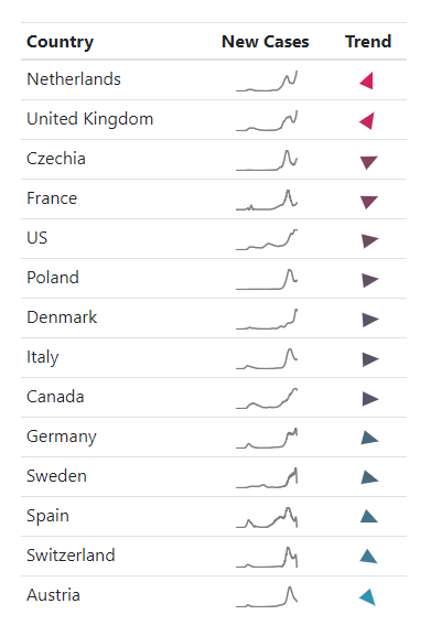
With our new metric, we can now monitor the trends for different regions, for instance. For our final report, we need a dense outline of the situation containing all the relevant information and drawing a clear picture like the table seen below: Each country is followed by a diagram - created with the popular Matplotlib - showing the new cases.
At the very left end, you can see the merits of our analysis as an arrow. Its rotation and colourization indicate the direction and likelihood of the trend. Due to the redundancy and choice of colours, form, and meaning of the symbol itself, you can spot rising and falling trends very quickly. Moreover, it is accessible for colour-blind people as well. Instead of creating the icons by hand, we overcome such a painful obstacle by programmatically creating the icons using SVG (Scalable Vector Graphics), giving us a tiny bit of code you can directly put into any website.

COVID-19 Trend Table (last updated on December 21st, 2020)
In the end, we create a single HTML file which you can open with all current browsers. The well-developed Bootstrap framework handles the layout. Of course, all graphics are embedded - either as SVG or as Base64-encoded images - allowing you to send the trend report to your colleagues or management, for instance, without having to send additional attachments.
Stay Informed, Stay Healthy
Even with a vaccine on the horizon, the pandemic is long from over. Thanks to the hard-working staff at John Hopkins and people worldwide, we are provided with vital information about the spread of the virus. But only with the help of Data Science can we grasp the hidden dynamic behind the raw numbers to help us deal with the current situation and protect people.
The complete Jupyter Notebook - fetching the data, analyzing it, and producing an up-to-date report - can be downloaded from my GitHub repository in hopes that you or your organization benefit from it. In these challenging times, I wish you all the best and of course: Stay healthy!
